The Anatomy of a Letter (Printable)
It’s time to celebrate! Every month in 2013 I’m learning a new craft, and now I’m halfway through.
When I focused on calligraphy in March, what I learned was that beautiful letters have just as much to do with [highlight bg=”#cf2b2c” color=”#ffffff”]typography design as they do with the physical strokes of calligraphy.[/highlight]
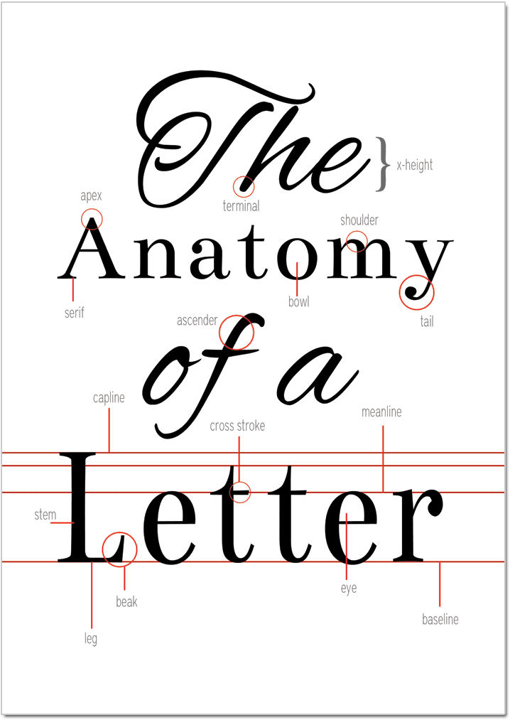
The deliberate form of each component is what makes letters so eye-catching. The space between letters (kerning), the form of each shoulder, the height of each beak — everything is carefully designed and put in place. It’s a form of art that started long before we created machines to do our writing for us.
I’ve designed this free ‘Anatomy of a Letter’ print for you. It’s not an exhaustive source for all the terms, but it gives an idea of just how much thought is put into letter design.
(And who doesn’t like a pretty print!)
Download ‘Anatomy of a Letter’
A4 Printable (Free PDF)
[divider top=”0″]
The Fonts
‘Anatomy of a Letter’ is made with free fonts. Get them here:
- Bentham (‘Anatomy’, ‘Letter’)
- District Pro Thin (Labels)
- Alex Brush (‘The’, ‘of a’)
Download the print and let me know what you think!
Lots of crafty love,
![]()


